 Shutter island
 is a psychological thriller/horror film from 2010. It was directed by Martin Scorsese and the production companies were
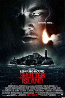
Appian Way Productions and Phoenix Pictures. It has made a worldwide total gross of $294,804,195 and had a budget of $80,000,000.
The colour palette is dark and uses black, white, grey, a dull blue/green and a bright red for the film title. This is very conventional for thriller/scary film posters because it looks intense and interesting to the target audience. The colour red connotes passion and aggression which links to the film and genre quite well.
The masthead doesnt actually take up that much of the poster and is quite small in comparison to other media items, for example magazines. The masthead is at the bottom half of the screen underneath the main image which is common for a film poster and gives the poster a good hierarchy so the audience's eyes follow down the poster instead of being confused and their eyes not knowing where to look.
The layout of this poster is very conventional, featuring one main image (usually heavily edited with characters and something from the film to interest audience), the location of the film's title is conventionally at the bottom of the poster and is followed by 'the small print' which is white writing, which gives all the credits of the people and companies that helped create the film. The phrase 'Someone is missing' is written in front of the main image right above the lit match in the picture and is over some of the star vehicle's face which isnt conventional but helps the reader to see the text even though its quite small, this is quite good in terms of not being too loud but still making the audience see it and ask themselves the question.
The main image of this poster is quite interesting and does a good job of setting scene but with no context or plot spoilers. It includes a photo in black and white of Leonardo Dicaprio who plays the protagonist in the film and is the star vehicle as he is very famous and great at acting. His facial expressions suggest that he is confused or questioning something which gives a mysterious feel and the lit match in front of his face suggests he is looking for something in the dark which makes the audience wonder what it is he may be looking for. Underneath the image of the protagonist is a picture of the island, that the film is set on. It is made up of different rectangles which arent aligned perfectly which give it a distorted look and makes it look quite mysterious by connoting a distorted reality on the island. It is raining and there is a rough sea in the picture of the island aswell which makes it look gloomy and connotes that something bad or upsetting is going to happen through Pathetic Fallacy.
 Awake
Awake is a Conspiracy thriller film from 2007. It was directed by
Joby Harold and produced by Jason Kliot, John Penotti, Joana Vicente & Fisher Stevens. It has made a worldwide total gross of $32,
685,679 and had a budget of $8,600,000.
The colour palette is dark and uses black, white, grey, a dull and a bright red for the Coming Soon at the bottom of the poster. This is very conventional for thriller/scary film posters because it looks intense and interesting to the target audience. The film title has a slight blue hint to it which sets it out from the more neutral white tones in the image. The colour blue connotes coldness and is quite a depressing colour which links to the film and genre quite well.
The masthead doesn't take up much of the poster and is at the bottom half of the screen underneath the main image which is common for a film poster and gives the poster a good hierarchy like the Shutter Island poster.
The layout of this poster is very conventional, featuring one main image, the location of the film's title is at the bottom of the poster and is followed by credits of the companies/people that helped to create the film. At the side of the poster to the right of the image it has text which attracts the audience and poses questions to make them want to watch the film. The text says 'Every year 21 million people go under anaesthesia. One in 700 remain awake the entire time. When they planned her husband's murder, they never thought he'd be the one.'
The main image of this poster is interesting and also does a good job of setting scene but with no context or plot spoilers. It includes two photos in black and white of the two main characters, they have placed Jessica Alba further to the front because she is more recognisable and famous than Hayden Christensen and her character is more involved in the story and narrative. Their facial expressions are quite blank and maybe even upset which makes the viewer wonder why Underneath the two faces is a picture of three surgeons that look like they're in a discussion over a patient that is under anaesthetic.
 Jessabelle is a supernatural thriller/horror film from 2014. It was directed by Kevin Greutert and the production companies were Lionsgate and Blumhouse Productions. It has made a worldwide total gross of $6,998,359 and there wasn't any information on the actualy budget of the film online but it was a low budget film.
The colour palette is actually quite light compared to the other posters I have looked at and uses black, white, grey, a dull neutral hair, skin and lip colours for the antagonist and protagonist you see on the front. The neutral and dark colours are very conventional for thriller/scary film posters because it looks intense and interesting to the target audience. The colour red on the protagonists lips connotes passion and aggression which links to the film and genre quite well.
Jessabelle is a supernatural thriller/horror film from 2014. It was directed by Kevin Greutert and the production companies were Lionsgate and Blumhouse Productions. It has made a worldwide total gross of $6,998,359 and there wasn't any information on the actualy budget of the film online but it was a low budget film.
The colour palette is actually quite light compared to the other posters I have looked at and uses black, white, grey, a dull neutral hair, skin and lip colours for the antagonist and protagonist you see on the front. The neutral and dark colours are very conventional for thriller/scary film posters because it looks intense and interesting to the target audience. The colour red on the protagonists lips connotes passion and aggression which links to the film and genre quite well.
The masthead doesnt take up much of the poster and is at the bottom half of the screen underneath the main image which is common for a film poster and gives the poster a good hierarchy so the audience's eyes follow down the poster instead of being confused and their eyes not knowing where to look.
The layout of this poster is very conventional, featuring one main image, the location of the film's title is conventionally at the bottom of the poster and is followed by 'the small print' which is white writing, which gives all the credits of the people and companies that helped create the film. The phrase 'The dead are back for life' is written underneath the masthead and imageage the text is quite small, but is quite good in terms of not being too loud but still making the audience see it and ask themselves the question.
The main image of this poster is very interesting and eye catching. It includes a photo in black and white of Sarah Nook who plays the protagonist in the film facing right and Amber Stevens who plays the antagonist who is facing left, they are both quite new actors in the scene and haven't been in many films. The image is interesting as the two faces are attached to each other
by the hair thats wrapped around their necks. The girl on the left's face is quite dark and covered with wet and dirty looking hair which makes her look ghoulish and dead. The girl on the right's facial expression is very blank and a little bit scared looking, her face is very bright and lit up which contrasts the girl on the left. I think this image is very eye-catching and interests the viewers. The background of the poster is textured and looks like a dirty wall and is shadowed in the corners so that the audience's eyes are more attracted the the centre.


 This question shows me that the people who answered my survey are in the right age group so the results from my survey are reliable. The results from this question show me that 100% of the people that took the survey are between 11 and 24.


