
Content Page Analysis:
Kerrang!
First I will analyse the contents page from the Kerrang!
magazine, I will explore it in terms of layout, colour, typography, lexis etc.
By doing this, it will allow me to understand other magazines with the same
target audience and the methods they use to attract the specific audience of
15-24 year olds.
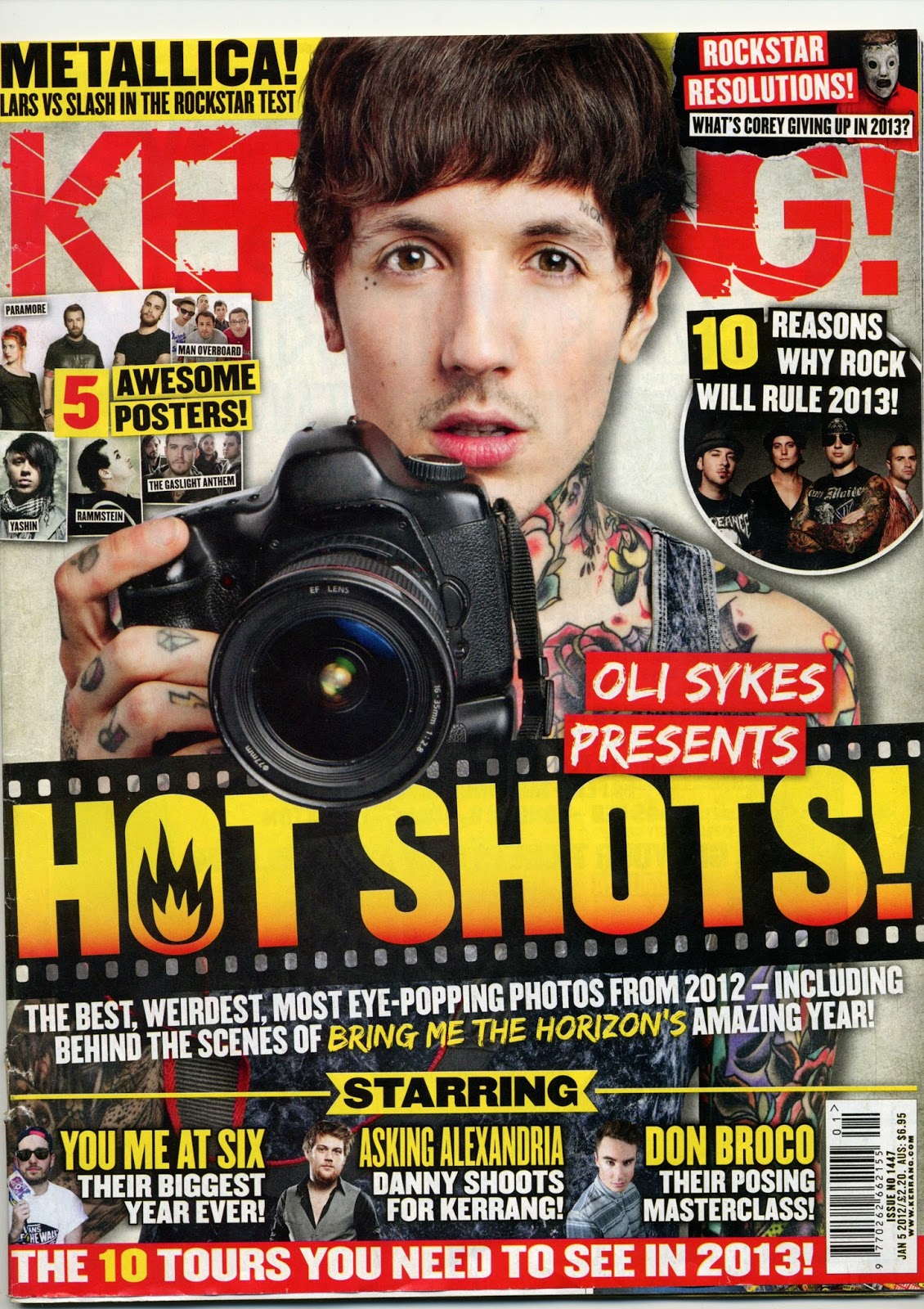
The masthead of the contents page is
very bright due to the colours, but not very big. It is made from two different
fonts; the word Kerrang is in the signature Kerrang shattered font and the word
contents is in a more conventional font with fading of one or two letters. The
fonts connote uniqueness and give an edgy rebellious look, which may relate to
the audience if you look at the theory by Dick Hebdige in 1988 who said youths
are portrayed as both fun and as trouble makers.

There are a few different styles of typography on the page
but the different styles are outrageous and make the page neat. A lot of the
writing is in a formal font, but the subheading are in a shatter/faded looking
font, this means that the readers eyes are drawn to the more outrageous titles,
then read down to the more formal conventional fonts that wouldn't be as
readable if they were also in a more elaborate font. The
cracked/faded font connotes edginess, which would represent the audience.
I think when it comes to making my page's contents page I will use an eye-catching masthead and use typography that is consistent and complimenting to the page.
The basic layout of the contents
page follows some convention that other magazines of the same genre follow. I
think the contents page is laid out in a very unique and
effective way because it is really appealing to the eye, and although it
contains a lot of writing, it isn't extremely cluttered due to the smart
layout. The text box, which actually
contains the contents, that runs down the right hand side of the page is very
standard to the conventional magazine contents page.
The main image stays within its
target audience very well, it achieves this by promoting a competition to win
tickets to meet a famous band. A large image is not conventional with most
other genres of magazine, but seems to be a trend in music magazines as a way
to keep the reader's attention so when they turn the page and see another well
known band that they are familiar with, it gives them the sense that the whole
magazine will be about bands they know.
Below the main image is a small box
containing what I think is an editor’s note to the reader, which is a
conventional thing to find on the contents page.
The layout of the content's page is
full, but tidy and sticks to most music magazine conventions whilst keeping
uniqueness. When creating my music magazine I will also try to concentrate on
keeping it tidy and unique by sticking to some conventions.
The colours red, white and black,
which are used on the contents, page match the pallet used throughout the
magazine and follow the Rule of Three. The red and yellow throughout the page
highlight different bits of text and keep the page balanced. The use of dark
and bright colours on the page supports Stanley Hall's theory that youths are
rebellious.
Red is not used as often as the
other colours on the page which makes the bits of text that are red more eye
catching than the other colours. The yellow on the page to make the masthead
more pronounced and it is also used in all of the subtitles giving a uniform look
and guiding the eye down the page. The black and white are composed well across
the page and are balanced overall. The colour yellow connotes energy and evokes
cheerful feelings, giving the page a happy, energetic look which conflicts the
Hall theory because he stated that youths are depressed and lazy, and the
colour connotes happiness and energy. The colour red connotes war, power and
anger, which supports Hall's theory that all youths are criminals.
The image used on the page is of a
band and is promoting a competition to win tickets, this represents the
audience because you will only usually find competitions in magazines aimed at
youths (teenagers and young adults) and it is also of a popular band. The size
of the image is also quite large, going against most conventions and because it
is quite large it gives it the page a bold look that is what many teens like to
see. The boldness may relate to Hall's theory that "Youth must have
excitement"
The image is quite dark and all of
the people are wearing all black, which contrasts very well with the white and
yellow background that surrounds it, making it bold. The black clothes also
connote rock music as rock artists stereotypically wear black clothing. The
black clothing and interesting contrast on the page makes it stylish
and interesting to look at. One of the males have a top that says 'No
regrets' in a painted on effect, this connotes rebelliousness and links to the
target audience of rebellious youths.
The language used on the page is
conventional to music magazines with the same target audience; this is because
the language is very modern and youthful. Words like Win! and Ultimate
give the page a more energetic look because the words connote positive and
energetic things. The fact that the words are used to make the page more
energetic and enthusiastic conflicts with Hall's theory that youths are
depressed and lazy. The language used is also related to music and is
informal, words like Gig are used to try to relate to the audience and seem
chatty and informal making the page easier to read through and allows the
reader to stay interested at the informal language, and not get bored like they
may with formal language.
Q
Secondly I will analyse the contents page from the Q magazine, I will explore it in terms of layout, colour, typography, lexis etc. By doing this, it will allow me to understand other magazines with the same target audience and the methods they use to attract the specific audience of 15-24 year olds.
The masthead of the contents
page blends in a lot with this contents page. It isn't very
bold and doesn't really stick out of the page very much. The title
of the magazine is more noticeable than the title of the page because the colour
used contrasts against the red better than the black. The title does look
quite professional due to the conventional font style. I think the
magazine looks like it's aimed more for the older ages in the target range and
not the younger ages.as both fun and as trouble makers.

The typography of the page is all very similar and not very
eye-catching, but it is very consistent which helps the page look
unified and gives the page a nice aligned set of writing which guides
the eye down. A lot of the writing is in the normal Q magazine font
but the subheadings are bolder than the rest. This means that the
reader’s eyes are drawn to the bolder titles and their eyes are guided
down the page with the consistency of font.
The basic layout of the contents page seems very unique
and slightly strange. The page seems very random and things seem to
be placed with no thought or consistency.
The text box, which contains the
contents, that runs down the left hand side of the page is very standard to the
conventional magazine contents page. But to the right and below the main image
you can see page numbers and pictures, which are at different angles and seem
out of place. There are also a lot of empty white spaces on the page, which
make the right side of the page look heavy.
The main image also seems out of place and looks too large
to fit on the page. The image can be good when attracting certain audience
because it is very in your face and the fact it is overlapping other parts on
the page makes it pop out and protrude from the page. To the target
audience this might be appealing as it has a very rebellious nature and
conflicts the conventional contents page. Overall I think that the layout
of the page is very unique and unconventional which relates to Hall's theory
that youths are criminals and therefore rebellious.
The colours used on the page follow the rule of three but
the red is used a lot more on the page as background sections for text. All of
the text is either black or white making the page very conventional. The red throughout
the page helps to separate different bits of text and keep the page balanced.
The use of dark and bright colours on the page supports Stanley Hall's theory
that youths are rebellious.
Red is used most often at the top of the page meaning that
the eyes start at the top due to the eye-catching colour and then slowly read
downwards. The black and white text is balanced overall giving consistency
across the page. The colour red connotes war, power and anger, which supports
Hall's theory that all youths are criminals.
The main image used on the page is of a man called Dave
Grohl who is a multi instrumentalist and lead singer for the band Foo Fighters,
he was also the drummer in a very famous late 80's to 90's grunge band called
Nirvana. The image is very large and isn't bordered and doesn't have its own
section of background, which is very eye-catching and helps it blend into the
page because it does pop out a lot. The boldness may relate to Hall's theory
that "Youth must have excitement". Dave Grohl has tattoos and a
guitar slung over his should and is looking away in a moody way. His tattoos
and long hair connote rebelliousness as he is rebelling against society's view
of men.
There are several other images
across the page, one being and image of the front cover, two being images of
double page spreads that are included inside the magazine and two of other
bands. The top image of a band is a very stereotypical image for an indie rock
genre band, the men are all very pale, and wearing very hipster looking coats
as they look at the camera with no emotion, giving them a vampire kind of look
and supporting Hall's theory that youths are depressed, because they all look
depressed. The bottom image of a band is very energetic and is a stereotypical
image of a punk rock band, the men are in the middle of jumping with their
guitars whilst the drummer sits and plays. One of the men is wearing no t-shirt
and is showing his tattoos, which is rebellious and supports Hall's theory.
The language used is aimed at youths; you can see this from
the use of slang. Words like 'Banging tunes' and 'Boozing, brawling...' are
colloquialisms associated with teens and young adults.
NME
Thirdly I will analyse the contents page from the NME
magazine, I will explore it in terms of layout, colour, typography, lexis etc.
By doing this, it will allow me to understand other magazines with the same
target audience and the methods they use to attract the specific audience of
15-24 year olds.
The masthead of the contents page is
very large and uses a very conventional font giving it an imposing and dramatic
look, which is very appealing as it is quite unique. The classic conventional
font used does not support Stuart Hall’s theory that all youths are
troublemakers and rebellious. The masthead reads ‘Inside this week’, and
coloured with black with a white background which is conventional for a
contents page and also conflicts with Hall’s theory.

The typography and fonts across the whole page look
traditional, the fonts are all classic clean fonts that you would expect to see
in a newspaper which may be due to the NME’s past as it originally started off
as a newspaper. The uses of fonts
doesn’t look consistent throughout the page but none of the fonts are
outrageous so the reader’s eye can read the page with ease and without being
distracted.
The layout
of the page seems to be centred which gives the page a sophisticated and well-edited
look making the page appealing. The page's layout is classic but you
don’t often see it as much in more modern music magazines, this gives the magazine a unique look compared to others of the same genre which may be more appealing to the people in the audience that are more indie and unique.
The page has just the right balance of pictures and writing and the composition of the page is very balanced. The page doesn't have a set column for the contents like the conventional page does, but it has an individual image and page number for each feature page and they're spread out across the whole page.
The page numbers that are alongside the image are very large and the introductory sentence to the page is about half the font size, guiding the eye downwards and giving the page fluidity.
In the bottom right corner you see an advertisement for the magazine promoting a special offer for the subscription to the magazine, this section has a dulled blue tone in the background, which isn't extremely eye-catching, but it is set out in a way that it will attract the reader to read the advert.
There isn't a main image on this page which is very unusual but sets this magazine out from the others that have the same target audience. In the centre of the page there are two pictures of the magazine's covers which show famous bands that are very well known from the genre which will attract the audience.
The page includes 5 other images that are paired with the contents, each image representing what the page includes. All of the images are of a different subject e.g. the top right one is of what I presume is a band sat on what looks like a cliff with the sea and other cliffs behind them, the bottom left is a studio shot of a female music artist wearing very smart and fashionable clothes and lots of make-up and the middle right picture is of an artist singing into a microphone at a gig/concert with the stage lights pointing toward him. The diversity of the types of pictures allows a wider target audience to be achieved because it shows different subjects that may be appealing to different people.
The page includes 5 other images that are paired with the contents, each image representing what the page includes. All of the images are of a different subject e.g. the top right one is of what I presume is a band sat on what looks like a cliff with the sea and other cliffs behind them, the bottom left is a studio shot of a female music artist wearing very smart and fashionable clothes and lots of make-up and the middle right picture is of an artist singing into a microphone at a gig/concert with the stage lights pointing toward him. The diversity of the types of pictures allows a wider target audience to be achieved because it shows different subjects that may be appealing to different people.
The colour pallet for this page is black and white with a blue section. The black and white on the page is very conventional, the use of plain colours may link the magazine back to when it was a newspaper and gives a minimalistic modern look that makes it appealing. The use of a plain dark colour like black links to Stanley Halls theory that all youths are rebellious and unique. The use of a white page background contrasts with the text and gives a minimalistic look. The colour blue connotes clarity, purity and depth (sea and sky) making the blue compliment the minimalistic theme of the page and also gives the page a pop of colour. The blue section highlights the specific section of page but also compliments the blue that you see on a few of the pictures making good composition.

