
Analysing Three Music
Magazine covers.
Kerrang!
The Kerrang’s
readership in July-December 2013 was around 293,00 people, 54.7% of the readers
in 2012 were Male and 45.3% of the readers in 2012 were Female and the majority
of readers were aged 15-24 years old. The magazine’s genre is mostly rock, but
you also see indie rock. The Kerrang Magazine is published by ‘Bauer Media
Group’ and was first published in 1981 as a one off magazine for the Sounds
newspaper and the magazine’s current Editor is James McMahon. In the early
2000s it became the best-selling British music magazine. The primary target
audience is 15-24 year old Males.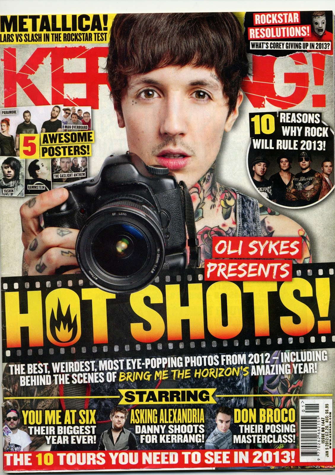 The masthead of the
magazine takes up a large proportion of the page, but at least 50 percent of it
is covered by the main image of the musician on the front. The word 'Kerrang!'
is written in a bright red colour and is shattered, this relates to the target
audience because it doesn't conform to the conventional masthead style that is
clear and easy to read, and the target audience may not be conformists to
society so they can relate. The word Kerrang is an onomatopoeic word that
sounds like the strum of a power chord on an electric guitar, this relates to
the type of music that the magazine represents, which is mostly rock groups,
and not acoustic sounding genres like folk or country. I think the Masthead represents Stanley
Hall's theory that "Youth must have excitement and if this is not hand in
the form of moral intellectual enthusiasms it is more prone to be sought in;
sex, drink or drugs" and "Adolescence is inherently a time of storm
& stress..." The masthead of the magazine supports the theory because
it uses an angry colour and is shattered so it relates to not conforming, like
teens that don’t conform and drink, have sex and take drugs.
The masthead of the
magazine takes up a large proportion of the page, but at least 50 percent of it
is covered by the main image of the musician on the front. The word 'Kerrang!'
is written in a bright red colour and is shattered, this relates to the target
audience because it doesn't conform to the conventional masthead style that is
clear and easy to read, and the target audience may not be conformists to
society so they can relate. The word Kerrang is an onomatopoeic word that
sounds like the strum of a power chord on an electric guitar, this relates to
the type of music that the magazine represents, which is mostly rock groups,
and not acoustic sounding genres like folk or country. I think the Masthead represents Stanley
Hall's theory that "Youth must have excitement and if this is not hand in
the form of moral intellectual enthusiasms it is more prone to be sought in;
sex, drink or drugs" and "Adolescence is inherently a time of storm
& stress..." The masthead of the magazine supports the theory because
it uses an angry colour and is shattered so it relates to not conforming, like
teens that don’t conform and drink, have sex and take drugs.The layout of the magazine is not very conventional, it is very full and the writing is not the usual layout you would expect to see, this gives a more unique and less sophisticated look that might attract and appeal to the target audience. The large bit of text across the middle of the page is more eye-catching than the masthead of the magazine because it is a brighter colour and not hidden behind anything else, this may be because it relates to an article or the issues theme. The page has 10 small images that relate to the text and one large image that gives a central point that can be a focal point. The page has lots of text around it that all relate to the articles inside. The sections of text highlight the names of the artists the articles are about which will appeal to the audience because if they know their favourite band is inside, they will want to buy it to read it. I think that the cover is more appealing to Females than males as it uses a big picture of a good-looking musician to be eye-catching. It uses more gender neutral colours and writing this so that it doesn’t aim too much at females. In 1975 the feminist Laura Mulvey published a paper which stated that the role of female characters in traditional media products function on two levels "As erotic object of desire for the characters within the story, and as erotic objects of desire for the spectator." I think that the cover supports this theory but switches the genders around because the male on the front could be seen as an 'erotic object of desire' to the female readers.
The colour palette of
the magazine is yellow, red and black. The colours are used on different
sections of text, but the main bit that is red is the title, giving is a more
eye-catching look. The colours make each section of text seem to pop out and
shout at you. The colour red this relates to the target audience because it is
very bright and in your face as you would expect teenagers that listen to Rock
music to be. The colour red usually connotes various things, but in this
masthead I think it represents anger, this could show the
rebellious non-conformist side to the target audience. The yellow on the cover
gives the Red a contrasting 'Pop' to make it brighter and more eye-catching.
The main image is a close-up of a very famous
Singer-Songwriter called Oli Sykes who is the lead singer of a successful metal
band called Bring Me the Horizon. Sykes is a suitable Star to use because he is
in a very well-known band that already has a very loyal fan base, therefore
more people will want to buy the magazine because he is on the Cover and
inside. He is also attractive which makes the cover more appealing to the
audience as his face is nice to look at. Sykes is covered in tattoos and has
the typical hipster/rock haircut which is the stereotypical young man rock look
that you see lots in the Rock magazines. Sykes is posing in a non-threatening
way which makes you feel very welcome and is holding a camera. The fact he is
holding a camera makes the reader question why, and want to read the magazine
to find out. It also may make the magazine stand out more from the others that
target the magazine at a similar audience because of the crossover of music and
photography. The fact that they used the photo because it is different from the
rest and doesn't conform to the conventional rock cover photo gives the cover
an edgy and rebellious look which may support Halls theory that all teenagers
"must have excitement and if this is not at hand in the form of moral
intellectual enthusiasms it is more prone to be sought in; sex, drink or
drugs.” and therefore rebel against the law.
NME
The NME’s readership
in 2013 was 411,000 and 73% of the audience were male leaving 27% of the
audience as females. The magazine’s genres include rock and indie music and it
is published by ‘IPC Media – Inspire’ and the current Editor is Mike Williams.
The NME was first published in March 1952 as a music newspaper and turned into
a magazine during the 1980s. In the 1970s it became the best-selling British
music magazine. The masthead doesn’t take up a lot of the page
even though the font is quite large. It is in a standard font that is very
squared due to there being no curves in any of the letters; therefore the
masthead is in a more conventional style compared to the Kerrang magazine's
cover page masthead. The conventional style may relate to the target audience
because it is a more classic look, and the target audience might be looking for
a magazine with rock and classic rock, unlike the Kerrang who look at Pop-Punk
and other genres apart from the standard rock genres. NME stands for New
Musical Express which isn’t a very 'Rocky' title so I think they shorten it to
give a more edgy and different look. When you say NME it sounds like the word
'enemy', this could intrigue the audience as well. The masthead represents the
target audience because it is red which is seen as an angry colour.
The masthead doesn’t take up a lot of the page
even though the font is quite large. It is in a standard font that is very
squared due to there being no curves in any of the letters; therefore the
masthead is in a more conventional style compared to the Kerrang magazine's
cover page masthead. The conventional style may relate to the target audience
because it is a more classic look, and the target audience might be looking for
a magazine with rock and classic rock, unlike the Kerrang who look at Pop-Punk
and other genres apart from the standard rock genres. NME stands for New
Musical Express which isn’t a very 'Rocky' title so I think they shorten it to
give a more edgy and different look. When you say NME it sounds like the word
'enemy', this could intrigue the audience as well. The masthead represents the
target audience because it is red which is seen as an angry colour.
The layout of the magazine is quite cluttered
and because of the pictures and large writing in the centre of the cover, it’s
difficult to bring the attention to the smaller writing near the side of the
page. There are no other images on the cover, but there is writing all the way
around the faces of the musician. The writing mentions a lot of stories that
are inside and also name drops a few times to allow the audience to recognise a
name and want to buy the magazine. I don't think the cover really has a
gendered look, but if I were to choose who, I'd think it would be aimed more at
males, due to the pain fonts and colour schemes. If the people on the page were
more attractive I would say that the cover represents the theory of the
feminist Laura Mulvey in her 1975 published a paper which stated that the role
of female characters in traditional media products function on two levels
"As erotic object of desire for the characters within the story, and as
erotic objects of desire for the spectator." But in this case, the models
aren't portrayed in a sexual manner so I don’t think it can relate to trying to
appeal to females.
The colour pallet is the same as the Kerrang!
one, using the colours red, black and yellow. I think they use the three
colours to allow the page to have different depths, and so your eye isn’t
attracted to one colour as all the colours are continued throughout the whole
page. The black is used because it is a classic colour and allows you to read
things easier if they have a light background. I think the red and yellow
colours are used because they are typically gender neutral colours and
therefore broaden the audience from one gender to two. The fact that the
colours are gender neutral and the stars on the front aren’t portrayed in a
sexual manner makes me think that the magazine represents the primary target
audience of Males.
The main image is a close up shot of 2 people
in the bang 'Arctic Monkeys' which is a very successful English Indie Rock
band. They have used the image of the two men because the magazine includes a
few articles involving them. The magazine also wants to attract the audience
because the Arctic Monkeys are very well known worldwide and has a large fan
base. The two men are posing moodily and looking directly into the camera, they
have their backs to each other which looks like they're having a disagreement,
this makes them seem slightly violent and rebellious as it isn't a conventional
pose you would see on the front cover of a magazine. This could relate to
Hall's theory that all youths are criminals. They could be posing moody to give
them an edgy rebellious look which might attract the audience more because they
might aspire to be edgy and different. They are both wearing classic high
collared black coats which used to be their classic sort of look that they
would wear in their early career. The black clothes could connote their
depressed emotions.
Q
The Q’s readership in
2013 was 339,000 people and 68.3% of the audience were males, leaving 31.7% of
the audience to be Females. The magazine’s genre is alternative and indie rock,
but it covers all genres of music. The magazine is published by ‘Bauer Media
Group’ but was first published by another media group in October 1986 and the
current Editor is Phil Alexander. Although the magazine has never won an award,
it is very successful and hosts an annual Music Awards show called ‘Q Awards’.
The masthead on this cover is very large considering it is only one letter. The font of the letter is a very conventional standard font but it really stands out due to the red background. The magazine is called Q because originally it was going to be called Cue (cueing a record), but the name was changed so that it wouldn't be mistaken for a snooker magazine. The name cue would relate to the target audience because it relates to music, which is the genre of the magazine that the audience will be buying but the name Q doesn't really relate to music much. I think that the masthead doesn't relate to the target audience of 15-24 year olds because it seems to traditional and old fashioned due to its font.
The magazine's layout is very cluttered and the writing covers a large proportion of the cover. Although the writing is edited in a way that seems very professional, some of it isn't placed very well on the page for example the writing at the top which reads 'THE STORIES OF THE YEAR' it is very persuasive and will attract the readers, but it covers over a quarter of the masthead. I think if the cover was cluttered with pictures and text then it would look very trashy, so they left out pictures to keep a more sophisticated look which may appeal to the audience. The layout includes one main focal image surrounded by lots of text that all relates to the articles inside. This is a method of attracting the audience because the writers of the magazine tend to name drop famous people in the little sections of text and write a story that would be interesting. The layout seems to be gender neutral. The theory that would relate the target audience to the untidy look of the page would be Stanley Hall's theory that youths are usually depressed and quite lazy.
The colour pallet of
the magazine is Red White and a little amount of Black which seem to be the colours that most
other magazines with the same/similar target audiences. The Red and White colours allow the different sections of text to become more readable, bright and contrasting to the dull/dark background. This makes the cover alot more appealing and eyecatching and allows your eyes to travel across the page because the colours aren't dull and boring to read. The colours are also used because they match the colours of the masthead and if they didnt then the colours wouldnt flow as well. The bright text and dark background doesnt conform to the conventional style of bright background and dark text, so this may relate to the target audience because it makes the magazine different from the other genres and is edgy and rebellious this relates to when Stanley Hall's theory says that between the ages of 12-24 criminal activity increases significantly, this means that the youths are usually rebellious.
The image on the cover is a Medium Shot of a very famous British singer/songwriter called Ed Sheeran. He represents the target audience because he isn't a typical pop star that makes pop music and is really attractive etc. He is very unique and creates different styles that the target audience might listen to. The magazine also says that it has the stories of Ed Sheeran which are good because he has had a very unique life where he started from busking and being 'homeless' and achived his goals. Sheeran is positioned square on to the camera but his face is pointing towards the top right of the page, this is unconventional and gives the magazine another unique look to attract the audience. Sheeran is wearing all black which although is quite edgy, is a trending thing at the moment, the leather gives him a rebellious look and the use of the guitar makes the magazine look professional and more music based. His hair is messy and his facial hair is unshaven which is usually his signature preffered look which is unconventional. The use of a male on the front links to Mulvey's theory that the role of female characters in traditional media products is that they simply function on two levels: “As erotic objects of desire for the characters within the story, and as erotic objects of desire for the spectator.” (Mulvey, 1975). But becuase the word has changed and womens rights are more equal, instead of females on the cover you tend to see males and females.
The image on the cover is a Medium Shot of a very famous British singer/songwriter called Ed Sheeran. He represents the target audience because he isn't a typical pop star that makes pop music and is really attractive etc. He is very unique and creates different styles that the target audience might listen to. The magazine also says that it has the stories of Ed Sheeran which are good because he has had a very unique life where he started from busking and being 'homeless' and achived his goals. Sheeran is positioned square on to the camera but his face is pointing towards the top right of the page, this is unconventional and gives the magazine another unique look to attract the audience. Sheeran is wearing all black which although is quite edgy, is a trending thing at the moment, the leather gives him a rebellious look and the use of the guitar makes the magazine look professional and more music based. His hair is messy and his facial hair is unshaven which is usually his signature preffered look which is unconventional. The use of a male on the front links to Mulvey's theory that the role of female characters in traditional media products is that they simply function on two levels: “As erotic objects of desire for the characters within the story, and as erotic objects of desire for the spectator.” (Mulvey, 1975). But becuase the word has changed and womens rights are more equal, instead of females on the cover you tend to see males and females.
No comments:
Post a Comment