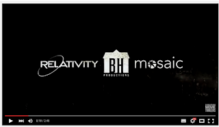
Idents, logos and graphics are important for a production company to have in the trailer as it get's the name out there in the viewers eyes and helps other film makers to look at the work that the company has already done to see if the production company would produce their film well.
https://www.youtube.com/watch?v=Lb5gmLsqt-o - This trailer is a trailer for a film called The Lazurus effect and is produced by Blumhouse productions which is the logo you can see in the centre of the screenshot to the left. The logo shows for 1.5 secs and is 18 seconds in. The three logos in a row zoom in as they are shown which sort of makes the viewer see them as it makes them in your face, I think it is a bit fast for the viewers to read all three but because the BH logo is in the middle and has a different graphic to the others it is more eye-catching. They have made to logo as a silhouette of the letters B and H with a grainy white house as a background and the word productions underneath. I think that the logo looks good but maybe should have had its own section in the trailer to make it more memorable and noticeable.
 https://www.youtube.com/watch?v=_DSMCbWo6u4 - This trailer is for a film called The Woman in Black - Angel of Death (sequel of The Woman in Black) and the logo of the production companies Entertainment One and Hammer films are shown for 2.5 seconds right at the beginning of the trailer. They fade in from the black background and have a spotlight with smoke in front that realistically moves to give a textured effect which is quite unique. I think this is similar to the one above but because there are only two logos and the smoky effect it gives it a more interesting look which may be more memorable to the viewer, I also prefer the fact that it is at the beginning and not mid way through the trailer like some are.
https://www.youtube.com/watch?v=5z3_vcRbi7k - This is the trailer for Captive, a thriller released in 2014. The ident at the beginning of the trailer is for entertainment one and the logo travels in as a bunch of dust particles which then come together to make the logo. The white background and black logo is quite different to the others I have seen which sets it out from the rest. The ident plays for about 3 seconds which is a good length of time as it shows the animation as well as just the logo, the animation makes it more interesting.


No comments:
Post a Comment